If you haven’t refreshed your website in the past three years, it might be a good time to consider future-proofing it before you fall completely behind. You would not leave your car without a service for three years, so you should view your website in the same way.
The pace of change in web design is relentless for anything technical. Technology never sleeps, it’s forever improving. The great thing is, however, if you look at your website every few years you don’t need to start from scratch. Having worked with dozens of businesses on refreshes, we have pinpointed the key areas that signal a website is stuck in the past.
Let’s walk through the seven most common culprits and the surprisingly straightforward fixes that can make your site feel current, trustworthy, and engaging again.
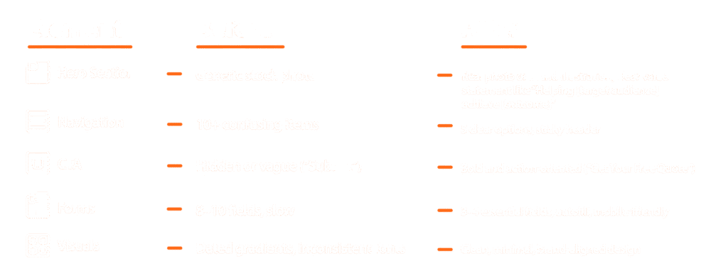
Spot the old, embrace the new: A side-by-side guide
Here’s a practical checklist of what to look for and what to do about it.
Above the fold
What it looks like: A large, rotating carousel of images or offers at the top of your homepage, often with tiny dots or arrows to click.
You might have one that says Welcome to Our Company, Learn More About Our Services, and See Our Latest Product all fighting for attention.
What to do: Be brave and pick a single, primary message for your homepage. Replace that slider with one compelling headline that speaks to your core value, a short sentence of support, and one clear, bold button telling people what to do next (e.g., Start Your Project or Browse Our Best Sellers).
Pro Tip: Try using a short, muted background video or a subtle animation in this section. It immediately feels more dynamic and modern than a static stock photo.
Layout
What it looks like: A perfectly symmetrical section with three boxes in a row, each with a simple icon, a title, and a few lines of text. It feels tidy, but also predictable and template-driven.
Why it’s a problem now: This layout was a staple of frameworks like Bootstrap. While it’s organised, it lacks personality and tells a visitor: ‘My site was built from a standard kit,’ not, ‘My brand is unique’.
What to do: Be brave and pick a single, primary message for your homepage. Replace that slider with one compelling headline that speaks to your core value, a short sentence of support, and one clear, bold button telling people what to do next (e.g., Start Your Project or Browse Our Best Sellers).
Scrolling
What it looks like: You scroll down the page, and everything moves at the same, rigid speed. The only interaction might be a simple color change when you hover over a button.
Why it’s a problem now: Modern websites feel like living brochures. A completely static page feels flat and fails to engage users on their journey.
What to do: The goal isn’t to create a circus. It’s about gentle guidance. Consider having elements fade in or slide into view as you scroll down. This technique, often called scroll-triggered animation, helps tell a story and makes exploring your site feel more like an experience. A gentle zoom effect on portfolio images or blog thumbnails on hover can also add a layer of polish.
Navigation
What it looks like: Your main navigation (Home, About, Services, Contact) is tucked away behind a three-line hamburger icon (☰) on the desktop version of your site.
Why it’s a problem now: While essential for mobile, hiding your navigation on a large screen is like putting your store’s directory in a locked drawer. It adds an unnecessary click and makes it harder for people to discover your content.
What to do: Give your most important links prime real estate in a horizontal menu bar. If you have a lot of pages, consider a “mega menu” that elegantly displays the options. Make it as easy as possible for visitors to find what they need.
Imagery
What it looks like: Your main navigation (Home, About, Services, Contact) is tucked away behind a three-line hamburger icon (☰) on the desktop version of your site.
Why it’s a problem now: While essential for mobile, hiding your navigation on a large screen is like putting your store’s directory in a locked drawer. It adds an unnecessary click and makes it harder for people to discover your content.
What to do: Give your most important links prime real estate in a horizontal menu bar. If you have a lot of pages, consider a “mega menu” that elegantly displays the options. Make it as easy as possible for visitors to find what they need.
Accessibility
What it looks like: Your main navigation (Home, About, Services, Contact) is tucked away behind a three-line hamburger icon (☰) on the desktop version of your site.
Why it’s a problem now: While essential for mobile, hiding your navigation on a large screen is like putting your store’s directory in a locked drawer. It adds an unnecessary click and makes it harder for people to discover your content.
What to do: Give your most important links prime real estate in a horizontal menu bar. If you have a lot of pages, consider a “mega menu” that elegantly displays the options. Make it as easy as possible for visitors to find what they need.
Website speed
What it feels like: A page that takes more than a few seconds to become usable, especially on a phone.
Why it’s a critical problem: Google now explicitly penalises slow sites in search rankings. Beyond SEO, your visitors will bounce. People’s patience for slow loading has evaporated.
What to do: Run your site through Google’s PageSpeed Insights. It will give you a clear report card and actionable tips. The usual suspects are unoptimised images and too many heavy scripts. Compressing images and choosing a quality web host are two of the easiest ways to see a big improvement.
The takeaway
You don’t need to tackle all of this at once. Pick one or two areas, like swapping out stock photos and simplifying your hero section. You’ll be amazed at the difference. Think of your website not as a static brochure, but as your hardest-working employee. Giving it these modern upgrades ensures it makes a great impression every time someone visits your website.